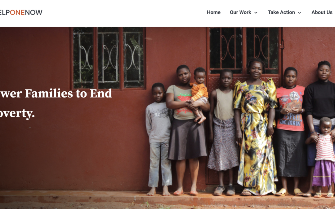
Powerful stories should be beautifully framed.
After months of planning, dreaming, and executing a new design strategy, the new Help One Now website is live. We’ve already thought of several reasons to love the new design, and we wanted to share them with you today:
1. A Sleek New Interface
We paid close attention to detail when perfecting this new edition of our website. We wanted it pixel-perfect.

2. Easier-to-Use Navigation
When it comes to website navigation, it can be tricky to strike a balance between not enough and too much. Our goal was to lead the website user into everything they need to know about Help One Now in a logical, easy-to-follow way.
3. A Clean, Eye-catching Design
We wanted to stay faithful to the brand and story you’ve come to know and trust, so the general feel of the site might seem similar to what you expect from our team. What we have done is make the site cleaner in its appearance and organization.
4. User-friendly, Transparent Online Giving
As always, giving online to Help One Now remains highly secure and dependable. We also took great strides on this new website to provide even more clarity about the impact your donations are making around the world.

5. A Movement Worth Sharing
And of course, our greatest concern in the redesign was having the ability to invite more people into the movement to end extreme poverty. We’ve highlighted serving and giving opportunities and created a space for updates about the work being done around the world.

We hope you love the new design as much as we do. So please, click around our site, explore, and share the word! Help us share the story that families are being empowered and communities are changing as far and wide as possible.
There is always room for people to join together in this work!